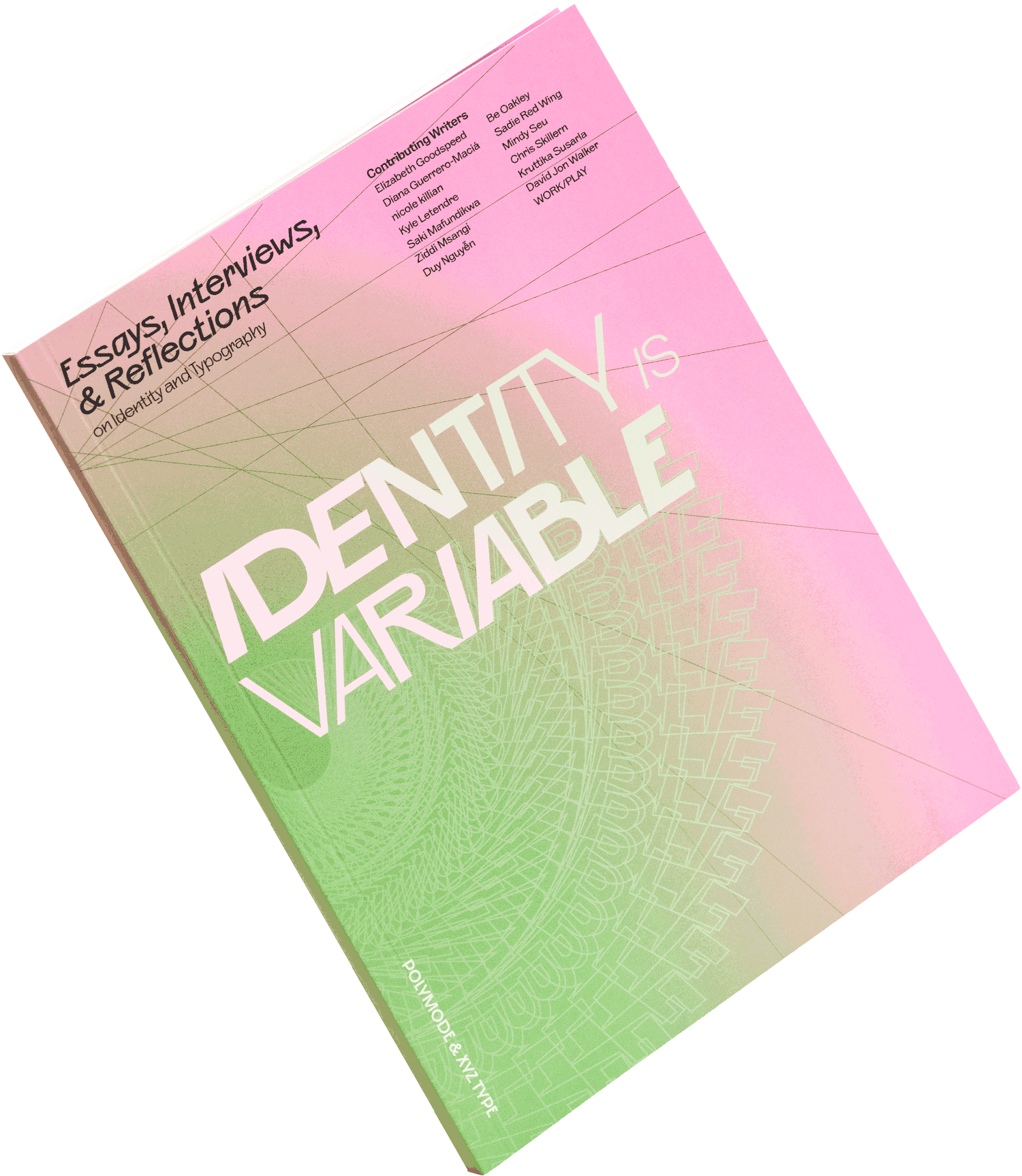
A Note on the Type
XYZ TypeDesign is personal for everyone at the studio Polymode. They bring their multifaceted selves into everything they create, establishing an intimate dialogue with the strong voices of their clients, many of whom are artists making deeply personal work, themselves.
When Polymode partners Silas Munro and Brian Johnson invited us to design a studio typeface for them, we knew they’d push us to make something exceptionally forward-looking, but we had no real idea what that would look like. This would be the font the team would reach for first in the future, whether they were designing a book, exhibition, identity system, or website. Polymode’s strength lies in meeting clients where they are, rather than leaning into a signature style, and they needed a typeface that both supported and reflected this key aspect of their practice.
The four of us started collaborating on the design early in the pandemic, over video calls from our various hidey-holes, and it quickly became a source of meaningful connection—and desperately needed laughs—in grim times. We found immediate kinship between our two studios and a comfortable ease in our discussions.
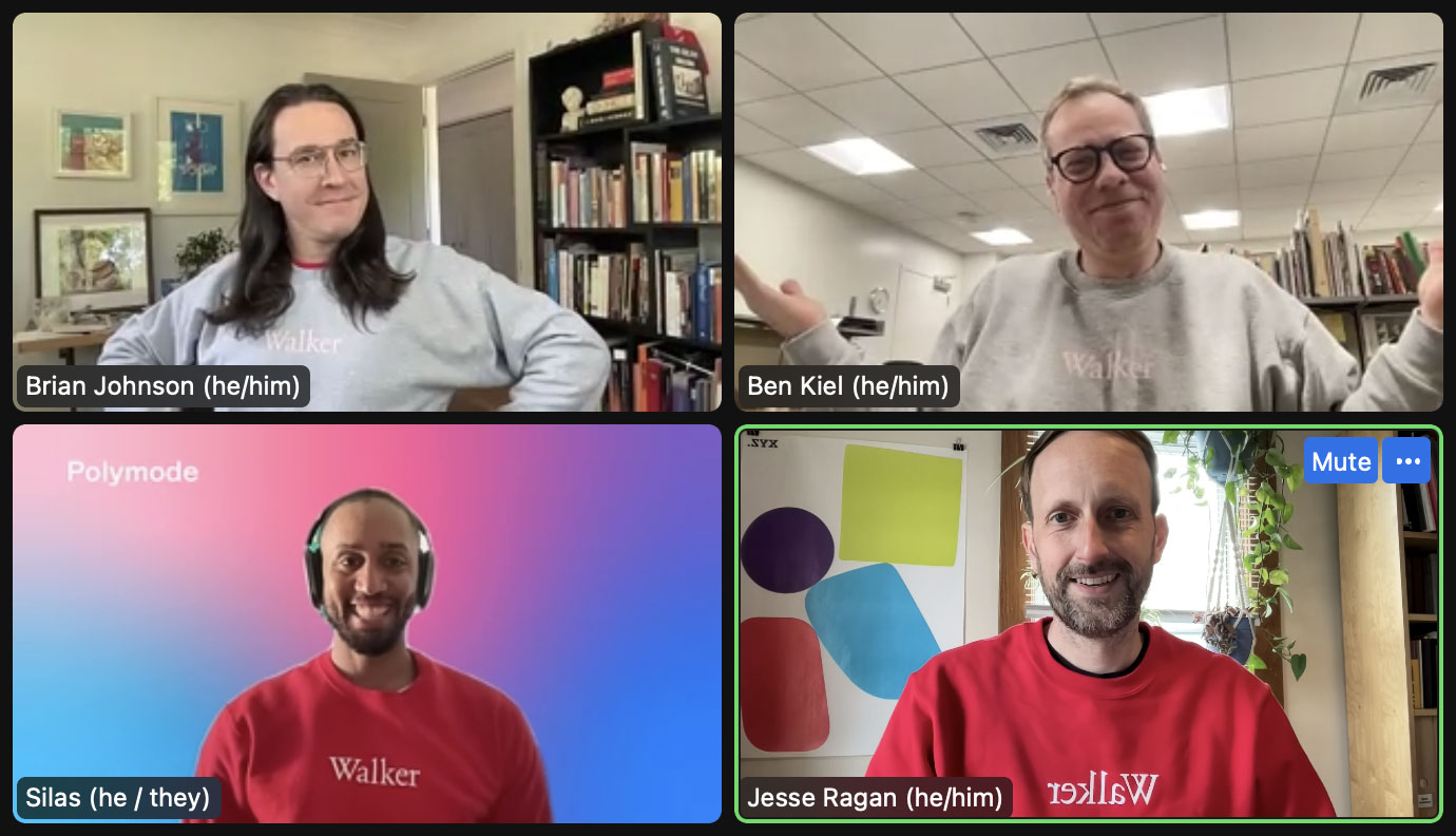
With so many interesting fonts on the market, not every client needs something custom, and even fewer want to be an integral part of the involved process of designing a new typeface. But Brian and Silas felt that Polymode was entering a new phase, and they wanted to seize that moment by taking ownership of the raw materials from which they make their work. For both partners, commissioning a typeface had long been a dream. Capturing the voice of their studio in that typeface—even giving it the same name—and making it publicly available would bring Polymode to a new level of participation in the wider graphic design community.
It would be a tall order to achieve all the studio wanted: a sans serif that would excel in running text for books, be fabulous on screen, and shine when used at extreme sizes for wall graphics. Polymode needed something with high readability, minimal friction, and an attention-getting presence. And since we planned to release the completed typeface through our foundry, it would also need to be flexible enough to be useful to other designers down the road.
Knowing the typeface would be named Polymode after the studio, we dug into the meaning of the word. To be polymodal is to contain multitudes. A polymodal typeface should be highly adaptable to different circumstances, delivering in contexts from soberly formal to playfully flamboyant. Yet, if we made a typeface inconspicuous enough to blend in anywhere, it would not get much mileage from a studio that often favors bold aesthetics.
Silas and Brian employed Polymode’s signature Poetic Research practice, gathering a collection of personal and historical images to communicate the conceptual footing they hoped to see in the typeface. Themes emerged around pride in the self, embracing cultural heritage, and claiming strength in what makes individuals unique. Taking our creative direction from ephemeral concepts that don’t exactly lend themselves to the medium of typeface design, we approached our design sketching phase largely on instinct.
So, where on earth were we to begin? Exploring this dauntingly open-ended aesthetic territory, we presented Silas and Brian with prototypes of several ideas. Drawing inspiration from old and new, we dug into our archives of sketches and reference images, lopping the serifs off a stuffy Clarendon, borrowing the distinctive counterforms from a Brooklyn bodega sign, and reinterpreting a bit of asymmetrical, stone-carved lettering from Madagascar as a flared sans. As a “safe” option in our comfort zone, we also threw in a direct revival of a 19th-century grotesque, the subtly eccentric Lining Gothic, which was eminently suitable for the banalities of job printing—newspaper advertisements, book title pages, invitations, and other ephemera.
We expected Polymode would veer toward a more experimental concept or possibly even request an unhinged hybrid of two or three of them—always a tricky proposition. So, naturally, they chose… Lining Gothic.
Wait, what?! Having not anticipated this oh-crap moment, we knew we’d have to breathe new life into this dusty, historical footnote.
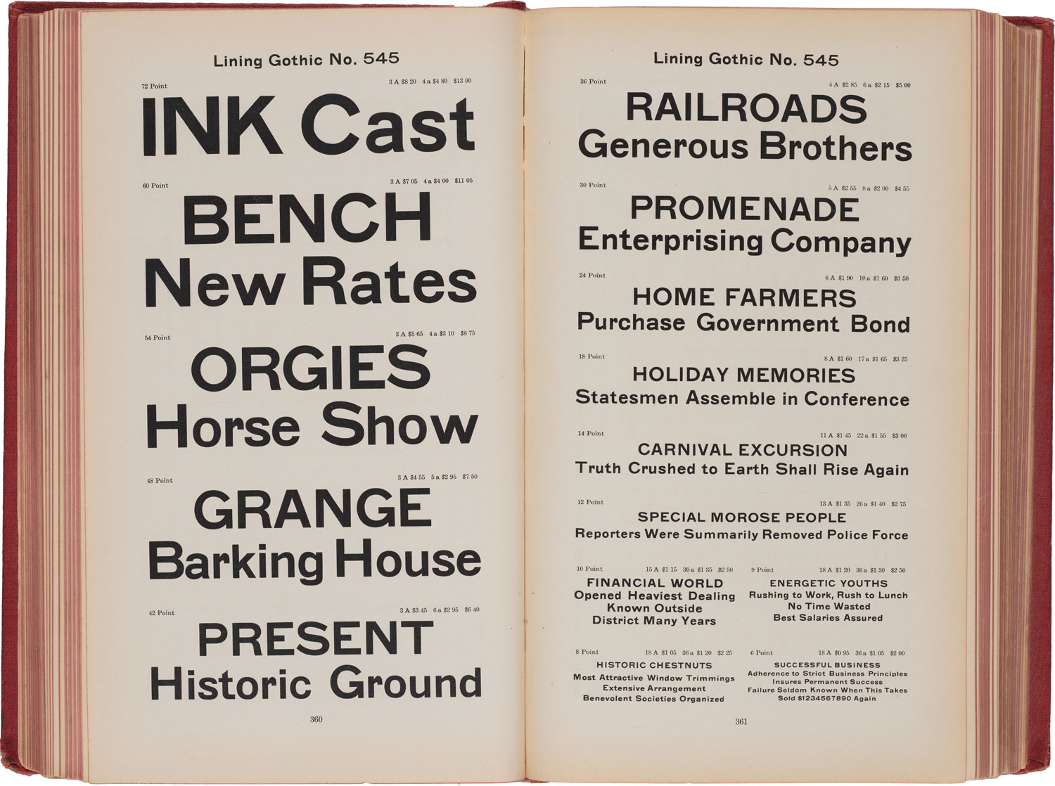
Designed by Charles Henry Beeler, and initially released by Philadelphia type foundry MacKellar, Smiths, and Jordan around 1885, Lining Gothic became a modestly popular workhorse among printers. Within the context of Beeler’s larger body of design work—ornamental flights of fancy that trade in the excess and exoticism of the era—Lining Gothic is notably the most conservative and practical. But it maintains a lively energy, driven by confident resistance to systematic norms, with unexpected, flattened curves, unusual proportions, and abrupt turns. Some unabashedly peculiar shapes peek out from under the surface, creating a subtle drama that resonates with ideas of queerness and othering.
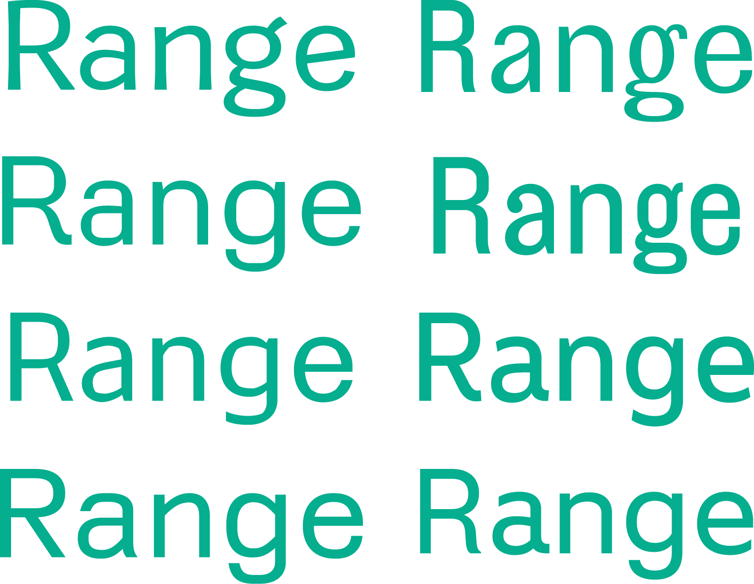
Polymode liked that Lining Gothic wasn’t too buttoned-up or too buttoned-down, but they asked if we could add some alternates or special features that would enable them to amplify or subdue the typeface’s personality in individual use cases. Reluctantly, we embraced a fact we’d been consciously avoiding: the best solution was a variable font. Although adding a dimension to the project’s design space would multiply our workload, we’d been looking for an opportunity to experiment with a variable font axis beyond the familiar characteristics of weight, width, and optical size.
To create a variable version of Lining Gothic that would suit 21st-century purposes, we first stripped it down to a plain, interface-optimized typeface, providing extreme versatility. Then, we considered the opposite: what is Lining Gothic at its most audacious? Projecting the simplicity of the plain version through the shapes of Lining Gothic into an otherworldly realm of stylistic exaggeration, we created a variable axis upon which the glyphs get progressively more expressive and harder to ignore, providing a strong voice. Polymode loved our sketch of this idea, and the project gained momentum.
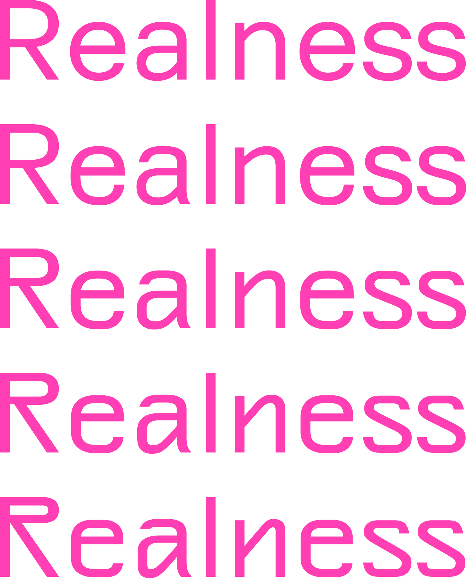
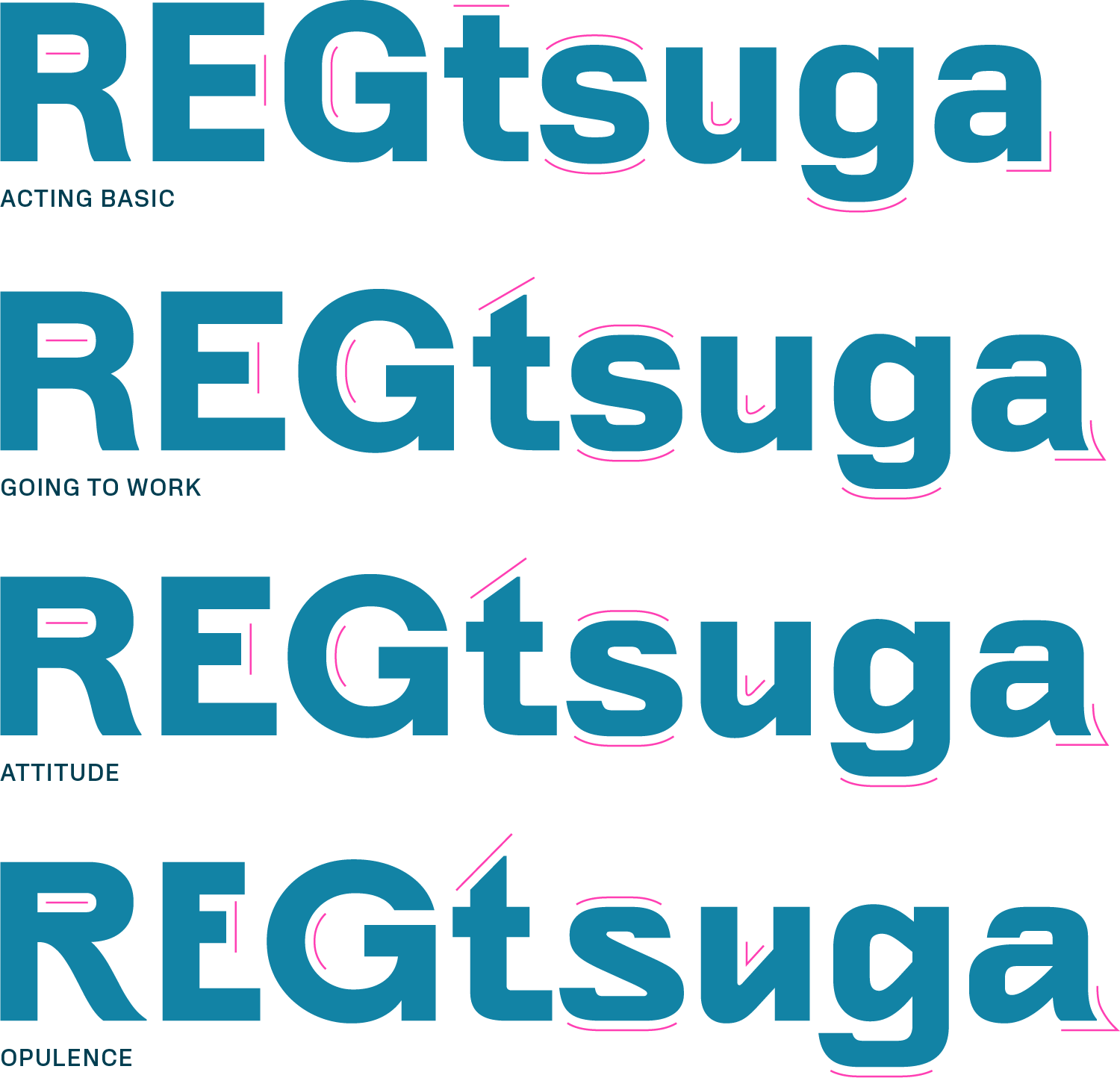
We called the variable axis “Realness,” a term used in queer Ballroom culture to describe taking on alternate identities and embodying them as authentically as possible. We pinpointed four distinct positions along that axis—Acting Basic, Going to Work, Attitude, and Opulence—which Brian and Silas named based on their vibes.
Polymode has already put them all to use. In What Matters Most: Photographs of Black Life, Acting Basic stoically steps out of the way of strong imagery, centering the Polaroids in this poignant book. Going to Work—the faithful revival of Lining Gothic—brings interest and energy to the running text in the Letterform Archive’s Strikethrough exhibition. In situations where the typeface needs to carry more weight, Attitude subtly emphasizes the quirks, as in the identity for the educational platform BIPOC Design History. And Opulence pulls out all the stops in Amanda Williams’s What Black Is This, You Say?, a text-heavy artwork that demands the font become the focus of attention. With the font’s variable functionality, Polymode can fine-tune to any position in between these four identities.
Ultimately, the strength of this typeface comes from the people who worked together to bring it to life. In addition to Silas and Brian’s astute creative direction, we could not have completed this multifaceted project without the assistance of Cem Eskinazi, who polished up details of the complex design system, added lighter weights, and significantly increased the number of languages the typeface supports by expanding the character sets of 18 source files. Cem achieved that rare balance of sensitivity, respect, and ownership in this project, and his elaborate project management document gave us an idea of how far process documentation could go. Connor Davenport and Romina Hernández also made important contributions to the final production of the typeface.
This project began in unsettled terrain and evolved into a contemplation of mutable identity. Through collaboration, we found that incorporating this elusive idea could, in fact, heighten the typeface’s functionality as a tool. Now, we’re eager to see how the identity of Polymode Sans itself evolves as others put it to use.